> ## Documentation Index
> Fetch the complete documentation index at: https://university.triggr-app.com/llms.txt
> Use this file to discover all available pages before exploring further.
# Field reference
> Every field in the Studio form designer, its properties, what it sends to your workflow, and how Field IDs and validation work.
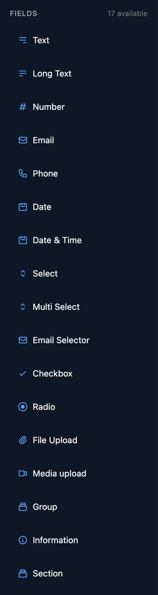
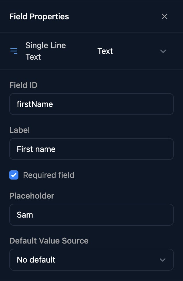
Drag a field from the **Fields** list onto the form, click it, and set it up under Field Properties on the right.
 ## What every field has
 | Property | Use |
| - | - |
| Type menu | Changes the type (not to Section or Media upload); options, Placeholder and Required field reset. |
| Field ID | How workflows read the answer: `{{ ctx.params.firstName }}`. See [Field IDs](#field-ids). |
| Label | The question the person sees. |
| Required field | Blocks sending until answered, while the field is visible. |
| Placeholder | Hint text inside the box; on a Checkbox, the text beside it. |
| Default Value Source | A Static value, or a key From parameters in the link's `?params=` ([Dynamic options](/studio/forms/dynamic-options#form-params-and-default-values)). |
| Conditional Rendering | Show or hide the field ([Conditional fields](/studio/forms/conditional-fields)). |
| Watch Fields | Reload options when another field changes ([Dynamic options](/studio/forms/dynamic-options#reload-options-when-another-answer-changes)). |
Triggr trims spaces from single-line answers before the workflow sees them.
## Text and numbers
| Field | `ctx.params` gets |
| - | - |
| Text | Text |
| Long Text | Text, line breaks kept |
| Number | The number as text, such as `"5"` |
| Email | Text |
| Phone | Text |
## Dates
| Field | Collects | `ctx.params` gets |
| - | - | - |
| Date | A day from a calendar | Local midnight as a UTC timestamp: `2026-06-30T23:00:00.000Z` for 1 July in UK summer time |
| Date & Time | A day, a time and a time zone, which starts as the person's own | `2026-11-02T09:30:00 Europe/London` |
To get back the day a Date picked, use the [date recipe](/studio/workflows/expressions#recipes).
## Choices
| Field | Collects | `ctx.params` gets |
| - | - | - |
| Select | One option from a searchable list | The option's value |
| Multi Select | Any number of options | A list of values |
| Radio | One option, all shown at once | The option's value |
| Checkbox | Ticked or not | `"true"` or `"false"` |
| Email Selector | A username and a domain from its options | `sam.taylor@acme.com` |
Select, Multi Select, Radio and Email Selector have an Options Source. Type each option's label and the value your workflow gets, or load the list from a workflow, Microsoft or an integration with [Dynamic options](/studio/forms/dynamic-options).
| Property | Use |
| - | - |
| Type menu | Changes the type (not to Section or Media upload); options, Placeholder and Required field reset. |
| Field ID | How workflows read the answer: `{{ ctx.params.firstName }}`. See [Field IDs](#field-ids). |
| Label | The question the person sees. |
| Required field | Blocks sending until answered, while the field is visible. |
| Placeholder | Hint text inside the box; on a Checkbox, the text beside it. |
| Default Value Source | A Static value, or a key From parameters in the link's `?params=` ([Dynamic options](/studio/forms/dynamic-options#form-params-and-default-values)). |
| Conditional Rendering | Show or hide the field ([Conditional fields](/studio/forms/conditional-fields)). |
| Watch Fields | Reload options when another field changes ([Dynamic options](/studio/forms/dynamic-options#reload-options-when-another-answer-changes)). |
Triggr trims spaces from single-line answers before the workflow sees them.
## Text and numbers
| Field | `ctx.params` gets |
| - | - |
| Text | Text |
| Long Text | Text, line breaks kept |
| Number | The number as text, such as `"5"` |
| Email | Text |
| Phone | Text |
## Dates
| Field | Collects | `ctx.params` gets |
| - | - | - |
| Date | A day from a calendar | Local midnight as a UTC timestamp: `2026-06-30T23:00:00.000Z` for 1 July in UK summer time |
| Date & Time | A day, a time and a time zone, which starts as the person's own | `2026-11-02T09:30:00 Europe/London` |
To get back the day a Date picked, use the [date recipe](/studio/workflows/expressions#recipes).
## Choices
| Field | Collects | `ctx.params` gets |
| - | - | - |
| Select | One option from a searchable list | The option's value |
| Multi Select | Any number of options | A list of values |
| Radio | One option, all shown at once | The option's value |
| Checkbox | Ticked or not | `"true"` or `"false"` |
| Email Selector | A username and a domain from its options | `sam.taylor@acme.com` |
Select, Multi Select, Radio and Email Selector have an Options Source. Type each option's label and the value your workflow gets, or load the list from a workflow, Microsoft or an integration with [Dynamic options](/studio/forms/dynamic-options).
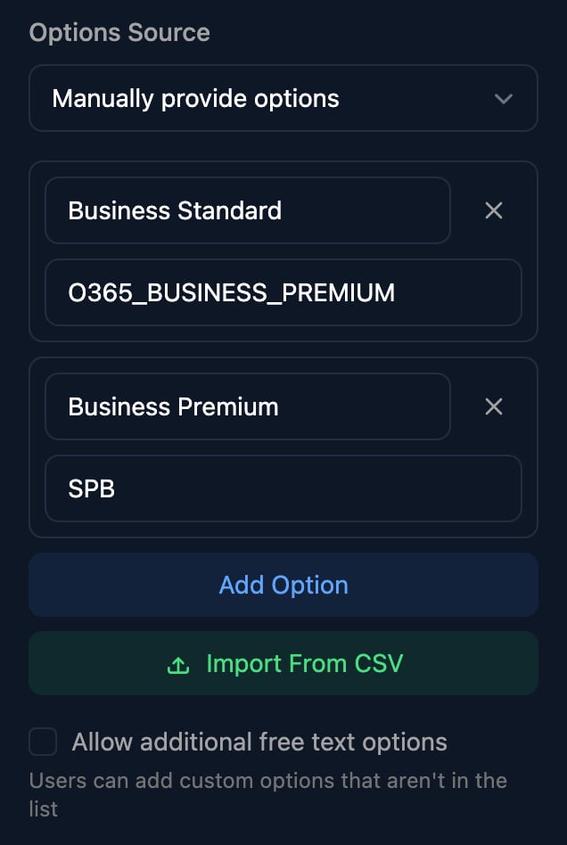 * **Import From CSV** loads a two-column file with a `Label,Value` header row, replacing or adding to the list.
* **Allow additional free text options** (Select, Multi Select and Email Selector) lets the person type an option that isn't listed.
* Give an Email Selector the Microsoft Domains source to offer the client's own domains.
## Files
| Field | Collects | `ctx.params` gets |
| - | - | - |
| File Upload | One file, or up to 10 with Allow multiple files; 25 MB each | A file reference, or a list of them |
| Media upload | Up to 10 photos, videos or audio files | A list of file references |
* **Import From CSV** loads a two-column file with a `Label,Value` header row, replacing or adding to the list.
* **Allow additional free text options** (Select, Multi Select and Email Selector) lets the person type an option that isn't listed.
* Give an Email Selector the Microsoft Domains source to offer the client's own domains.
## Files
| Field | Collects | `ctx.params` gets |
| - | - | - |
| File Upload | One file, or up to 10 with Allow multiple files; 25 MB each | A file reference, or a list of them |
| Media upload | Up to 10 photos, videos or audio files | A list of file references |
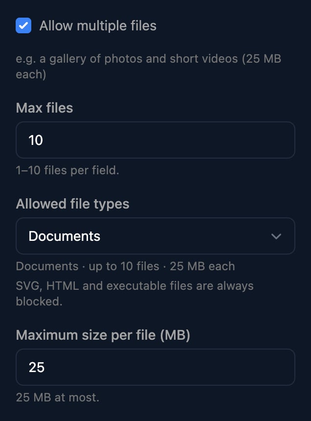 Allowed file types offers Images, PDF, Documents, Video, Audio, Photos, video & audio, Any supported file and Custom…. Files can't go inside a Group. [Media](/studio/media) covers using uploads in a workflow.
## Groups, information and sections
| Field | Shows | `ctx.params` gets |
| - | - | - |
| Group | A set of sub-fields the person can repeat, such as one row per device | A list with one object per entry, keyed by sub-field ID |
| Information | A heading and text, such as instructions | Nothing useful |
| Section | A titled, collapsible block of fields | Its fields' answers, by Field ID |
Allowed file types offers Images, PDF, Documents, Video, Audio, Photos, video & audio, Any supported file and Custom…. Files can't go inside a Group. [Media](/studio/media) covers using uploads in a workflow.
## Groups, information and sections
| Field | Shows | `ctx.params` gets |
| - | - | - |
| Group | A set of sub-fields the person can repeat, such as one row per device | A list with one object per entry, keyed by sub-field ID |
| Information | A heading and text, such as instructions | Nothing useful |
| Section | A titled, collapsible block of fields | Its fields' answers, by Field ID |
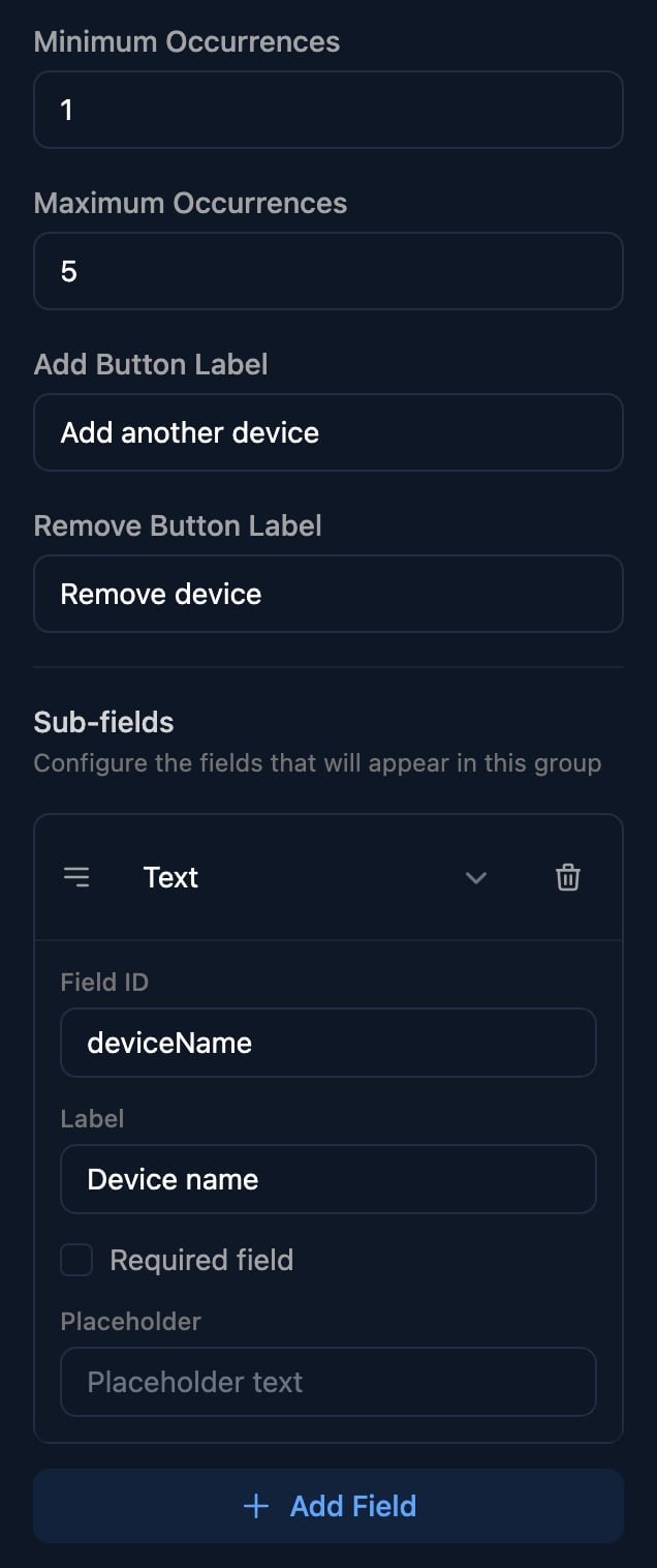 Click **Add Field** to add each part of a Group entry.
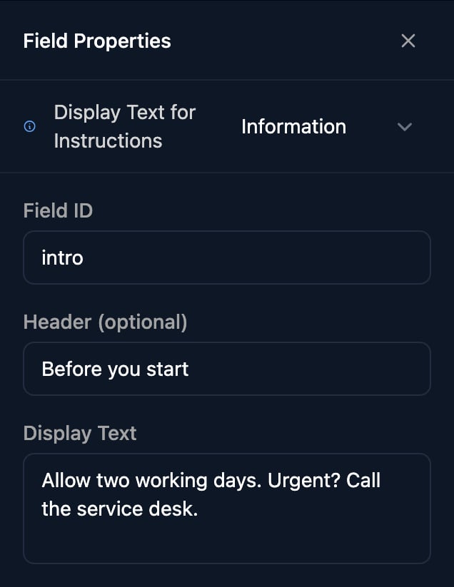 Display Text can show a value from the link's `?params=`, such as `{{ params.ticketId }}`.
Click the edit icon on a section's title for its Title, Description, Display Order, collapsing options and [conditions](/studio/forms/conditional-fields#show-a-whole-section).
## Field IDs
* New fields are `property1`, `property2` and so on. Rename them before you build the workflow.
* Use letters and numbers without spaces, such as `startDate`, so templates can write `{{ ctx.params.startDate }}`.
* IDs must be unique across the whole form, sections included (Group sub-fields only within their Group). A blank one resets to `propertyN`.
* Changing a Field ID breaks workflows and conditions that use the old one.
* To see what a workflow receives, click **View** on a submission under Submissions and untick **Pretty Format (Show Display Values)**.
## Validation
Required field is the only rule you set: the person sees “This field is required.” and Triggr checks again when the form is sent. An Email Selector also asks “Please enter a username.” or “Please select a domain.”; File fields enforce their types, count and size; Groups their minimum and maximum entries. Hidden fields are never required. Check anything else, such as a format, with a Condition step in your workflow.
## FAQ
Preview doesn't send or check answers. To test required fields, open the Public Form URL from **Share Form**; submitting there starts connected workflows for real.
Two fields share a Field ID. Rename one.
Workflows get each option's value. Make the value what the workflow needs, such as a SKU, and the label what people read.
This documentation is built and hosted on [Mintlify](https://mintlify.com), a developer documentation platform.
Display Text can show a value from the link's `?params=`, such as `{{ params.ticketId }}`.
Click the edit icon on a section's title for its Title, Description, Display Order, collapsing options and [conditions](/studio/forms/conditional-fields#show-a-whole-section).
## Field IDs
* New fields are `property1`, `property2` and so on. Rename them before you build the workflow.
* Use letters and numbers without spaces, such as `startDate`, so templates can write `{{ ctx.params.startDate }}`.
* IDs must be unique across the whole form, sections included (Group sub-fields only within their Group). A blank one resets to `propertyN`.
* Changing a Field ID breaks workflows and conditions that use the old one.
* To see what a workflow receives, click **View** on a submission under Submissions and untick **Pretty Format (Show Display Values)**.
## Validation
Required field is the only rule you set: the person sees “This field is required.” and Triggr checks again when the form is sent. An Email Selector also asks “Please enter a username.” or “Please select a domain.”; File fields enforce their types, count and size; Groups their minimum and maximum entries. Hidden fields are never required. Check anything else, such as a format, with a Condition step in your workflow.
## FAQ
Preview doesn't send or check answers. To test required fields, open the Public Form URL from **Share Form**; submitting there starts connected workflows for real.
Two fields share a Field ID. Rename one.
Workflows get each option's value. Make the value what the workflow needs, such as a SKU, and the label what people read.
This documentation is built and hosted on [Mintlify](https://mintlify.com), a developer documentation platform.